Sprinkles Bakery
UX Research
Client
School project.
Project Type
UX Research
Project Year
March 2025
Project Summary
This case-study focused on improving usability and engagement for Sprinkles.com, a premium baked goods website.
After careful review of the Sprinkles.com website and social media presence, the following items were observed:
01 — Research & Audit
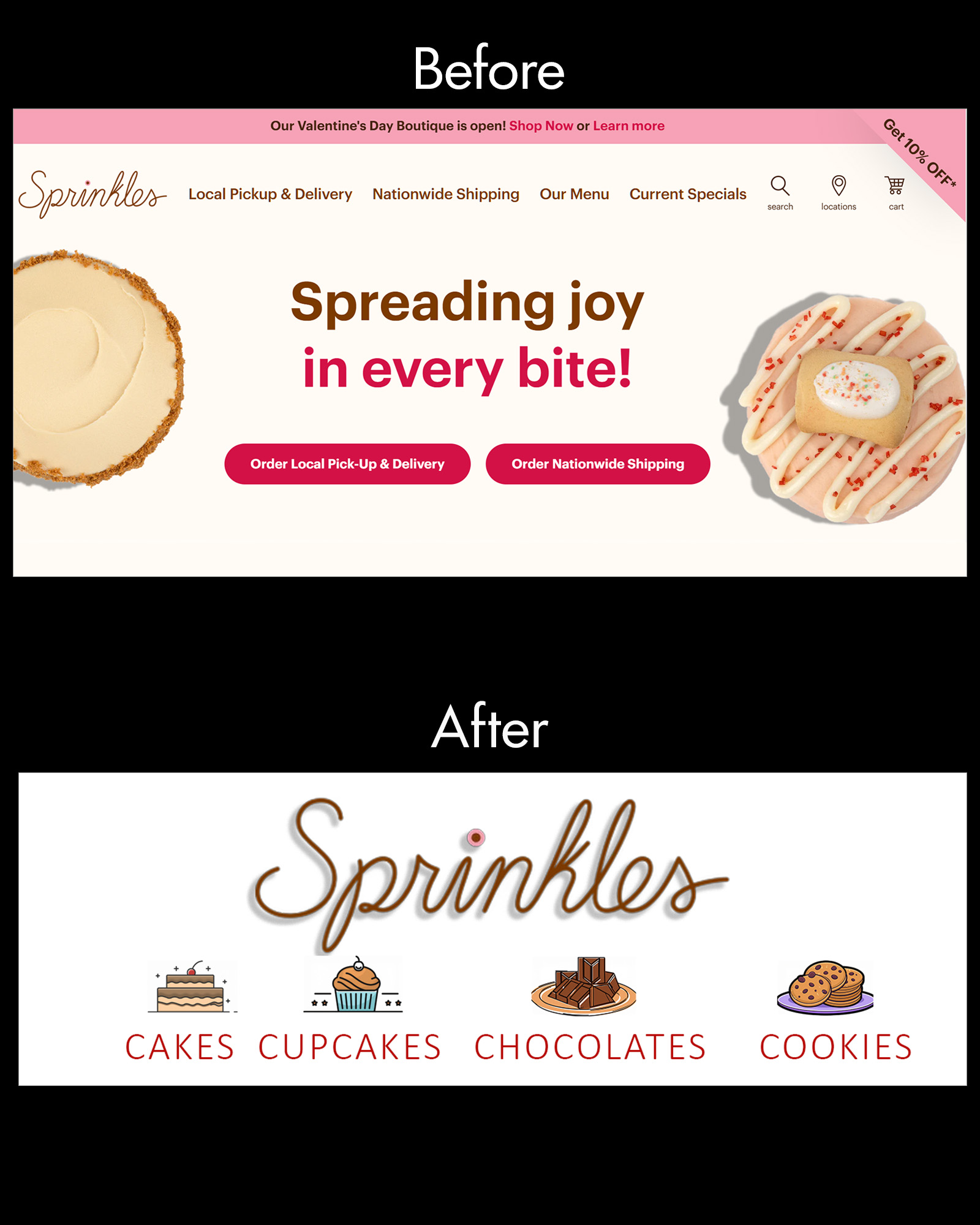
I reviewed the Sprinkles website and social media presence to evaluate usability, visual hierarchy, navigation, and engagement. The audit focused on how easily users could understand the brand, browse products, and move toward ordering.
Methods used:
• Heuristic evaluation
• Competitor benchmarking against Melissa and Baked by Melissa
• Social media audit across Facebook, Instagram, and X
• C.R.A.P. framework: contrast, repetition, alignment, and proximity
02 — Key Insights
The audit revealed that Sprinkles had strong brand recognition and appealing product imagery, but the digital experience lacked consistency across layout, typography, and engagement touchpoints.
Key issues:
• Inconsistent font sizes and hierarchy
• Weak navigation visibility
• Limited product image consistency
• Low posting frequency compared to competitors
• Missing engagement features such as rewards, blog content, or Save for Later
03 — Design Direction
I developed a visual direction inspired by warm colors, vintage packaging, and dessert-focused imagery. The goal was to make the interface feel more cohesive, premium, and easier to scan without losing the playful bakery identity.
Design priorities:
• Improve page hierarchy
• Strengthen product presentation
• Make navigation easier to understand
• Create a more consistent visual system
• Support trust through testimonials and secure-order cues
04 — Prototype & Refinement
I created a Figma prototype to explore a revised user flow and improve the ordering experience. The prototype focused on clearer navigation, stronger visual consistency, and a more direct path from product discovery to checkout.
Refinements included:
• Simplified order navigation
• Improved confirmation flow
• Increased readability
• Stronger brand consistency across page sections

Recommendation
I recommended that Sprinkles.com:
• Simplify navigation and improve search relevance
• Use consistent font and image scaling
• Integrate SSL trust badges and customer testimonials
• Add a blog or loyalty program to increase engagement
• Unify tone and brand story across web and social media