Home
>
Case  Studies
>
Guardian View

Maison Verlaine

Brand Design · UX Storytelling · Visual Identity
Client
Concept Project / Self-Directed
Project Type
Brand Design · UX Storytelling · Visual Identity
Project Year
December 2025

Project Summary

This case study focuses on the UX-driven development of a brand character that reinforces trust and craftsmanship without functioning as a traditional mascot. Maison Verlaine is a fictional luxury French macaron bakery positioned for a high-income, design-literate audience.

Problem Statement

The core question:
How can a brand character exist in a luxury context without becoming a mascot?

Many luxury food brands struggle to humanize their story without undermining perceived value. Traditional mascots and character illustrations often feel childish, promotional, or disconnected from claims of craftsmanship and ingredient integrity.

Process

Design Goals

The character needed to:

  1. Reinforce heritage and craftsmanship
  2. Signal expertise without explanation
  3. Align visually with natural, dye-free ingredients
  4. Support the brand story quietly, not performatively
  5. Increase trust and perceived value

Early Exploration (What Didn’t Work)

The initial illustration direction leaned toward:

  • Bright color palettes
  • Exaggerated facial features
  • Direct eye contact and smiling expressions
  • Presentational poses

Issues identified:

  • Read as mass-appeal or café-oriented
  • Suggested artificial colors despite brand claims
  • Felt promotional rather than artisanal

This created cognitive dissonance between the brand’s story and its visuals.

Iteration Strategy

Rather than discarding the character entirely, the decision was made to evolve her.

Key refinements included:

Visual Restraint

  • Reduced saturation across all elements
  • Natural, ingredient-led macaron colors
  • Neutral wardrobe tones

Editorial Illustration Style

  • Watercolor and paper textures
  • Hand-drawn line irregularities
  • Matte, print-like finish

Behavioral Shift

  • Downward gaze to imply focus
  • Mid-process gesture rather than presentation
  • No performative smile

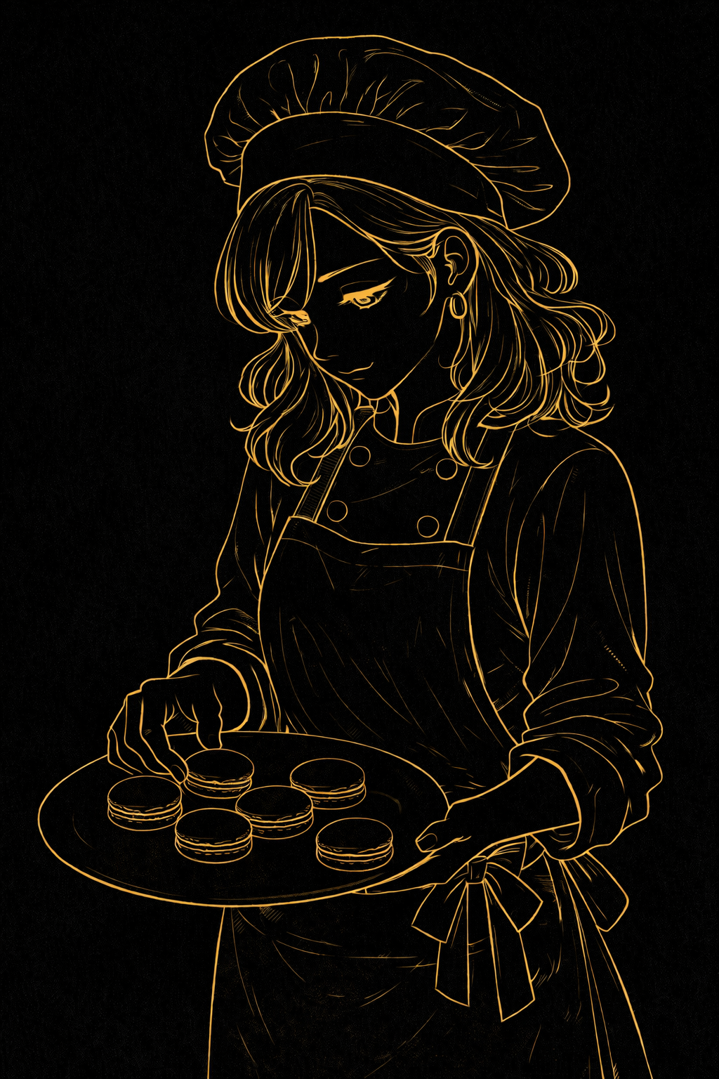
Final Brand Character: Élodie Verlaine

Élodie Verlaine represents the brand’s lineage—an artisan inheriting knowledge rather than inventing a persona.

She is shown:

  • Evaluating, not offering
  • Working, not posing
  • Focused on standards, not audience approval

This positions her as a guardian of quality, not a marketing symbol.
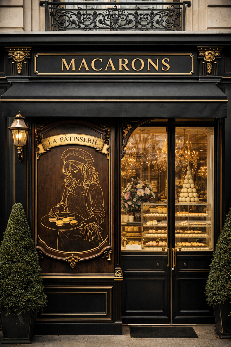
UX Rationale

From a UX perspective, the final character design:

  • Increases perceived price tolerance
  • Builds trust without copy dependency
  • Reduces visual noise on the page
  • Aligns emotional tone with brand promise
  • Supports storytelling without interrupting conversion

The character functions as a trust anchor, appearing only in editorial contexts.

Outcome

The final illustration successfully:

  • Humanizes the brand without cheapening it
  • Visually enforces ingredient integrity
  • Aligns illustration style with pricing strategy
  • Differentiates Maison Verlaine from novelty-driven competitors

This case demonstrates how UX thinking can guide brand illustration decisions, not just interface layouts.

Environmental Application (Final Proof)

The visual system was translated into a physical storefront context to validate longevity and real-world credibility. The engraved illustration functions as a heritage marker rather than a focal character.
© 2025 Michael Ayala