Home
>
Case  Studies
>
Sprinkles Bakery

Sprinkles Bakery

This project focused on improving usability, clarity, and engagement for Sprinkles.com, a premium baked-goods brand. I evaluated the existing experience, conducted competitor research, performed a social media audit, and identified issues affecting navigation, readability, and brand trust. My goal was to propose actionable design improvements that enhance conversions and strengthen Sprinkles’ overall digital presence.

Problem

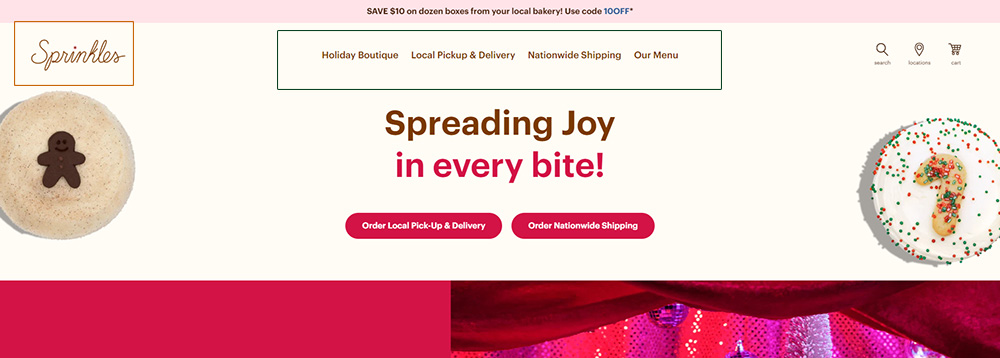
Inconsistent font sizes and hierarchy

Small logo size

Weak navigation visibility

Limited interactivity (non-clickable product images)

Underutilized social media presence (no recent X/Twitter posts)
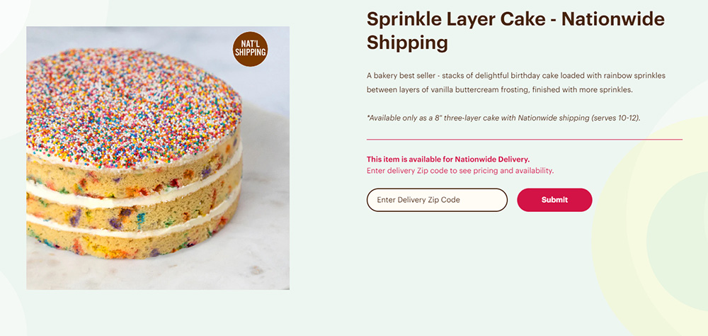
These issues made it difficult for users to navigate the site, understand product offerings, and make confident purchase decisions. As a result, Sprinkles risked lower conversions, reduced engagement, and inconsistent brand perception.

Process

Research:

  • Conducted heuristic evaluations to assess readability, hierarchy, and navigation.
  • Performed competitor analysis (Baked by Melissa, Kupcakerie).
  • Completed a social media audit (Instagram, Facebook, X) to evaluate brand engagement.
  • Applied the Content IQ framework: Intrinsic, Contextual, Representational, Accessibility.

Insights:

  • Typography inconsistency: Mismatched sizes and spacing created a fragmented experience.
  • Weak navigation visibility: Menu labels lacked hierarchy and clear entry points.
  • Inactive social media: No posts since April 2024, reducing trust and customer engagement.
  • Under-described product pages: Missing ingredient details and flavor profiles limited conversions.

Design:

  • Created mood boards inspired by warm cakes and vintage bakery packaging.
  • Designed new navigation concepts and homepage hierarchy.

Prototype:

  • Developed Figma prototypes focusing on readability and ease of navigation.

Test:

  • Conducted usability tests with five participants.
  • Measured clarity, navigation ease, and user confidence in ordering.

Result:

Usability testing showed significant improvements:

  • Users located product categories faster and with higher confidence.
  • Participants said the new hierarchy felt “cleaner,” “friendlier,” and “easier to scan.”
  • The redesigned product pages increased trust by improving clarity around ingredients and available flavors.
  • The modernized interface and consistent typography strengthened overall brand perception.

Solution

I recommended enhancements that improve usability, clarity, and brand consistency:

  • Simplify navigation and increase search relevance.
  • Apply consistent typography and scale images appropriately.
  • Integrate trust signals such as SSL badges and customer testimonials.
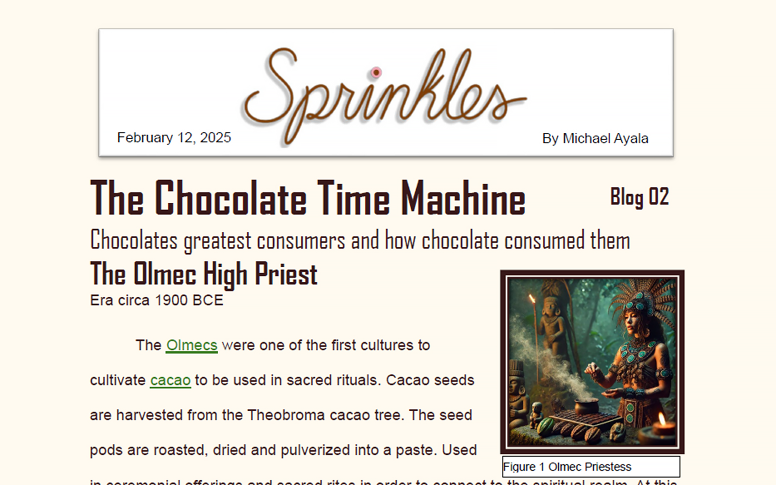
  • Add a blog and loyalty program to improve engagement and repeat visits.
  • Unify brand messaging across the website and social media platforms.
“This redesign improves readability and guides users through a clearer product discovery journey.”
"This mockup of a blog could be integrated into their website to bring in more customer interaction and engagement."

Reflection

Through this project, I learned how content strategy and usability are deeply connected. Improving readability and consistency directly strengthens user trust and retention. This experience also taught me the importance of aligning digital design with brand storytelling to create meaningful, cohesive experiences.
© 2025 Michael Ayala