Home
>
Case  Studies
>
Guardian View

Guardian View App

Designing With Empathy for Families and Caregivers
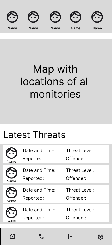
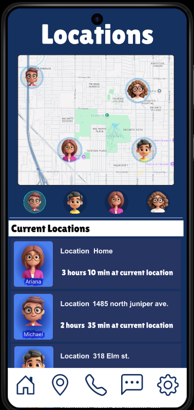
Guardian View is a conceptual mobile app that allows parents, guardians, and caretakers to monitor family members’ phone and social media activity for potential threats while maintaining simplicity, dignity, and trust. The goal was to simplify existing control tools, reduce overwhelm, and design a clear, reassuring experience for families.

Problem

In today’s digital world, families face growing challenges in protecting loved ones online. Parents struggle to monitor their children’s social media activity without violating their trust, and caregivers often feel powerless to help elderly relatives who are vulnerable to scams and misinformation.
Existing monitoring tools are frequently intuitive, cluttered, or privacy-invasive — leaving many families without a balanced, respectful way to ensure safety.

Process

Research & Methods

  • Reviewed existing parental control and monitoring apps.
  • Read customer reviews to identify pain points: confusing dashboards, excessive alerts, readability issues.
  • Consulted online resources from Kaspersky, the National Council on Aging, and ConsumerNet to identify real digital threats.

Key Insights

  • Parents want fast access to essential safety information.
  • Users dislike apps with visual clutter, complex menus, and overwhelming alert systems.
  • Elderly users need simplified layouts, large tap targets, and high-contrast visuals.
  • Privacy must be respected, not compromised.

Design Process

  • Empathize: Identified real-world needs from both parents and elderly users.
  • Define: Focused on one core use case — communication and threat monitoring.
  • Ideate: Sketched hand-drawn wireframes to establish a simple navigation flow.
  • Prototype: Built low-fidelity and mid-fidelity mockups in Figma, using Material Design 3.
  • Test: Gathered peer and family feedback about clarity and tone.
  • Refine: Improved hierarchy, spacing, alert language tone, and one-handed use patterns.

Solution

“Guardian View’s clean layout and icon-driven design make it easy for families to monitor important alerts while maintaining clarity, trust, and simplicity.”

I designed Guardian View as a user-centered monitoring platform that empowers families to stay connected and protected in a transparent, respectful way.

Through research and empathy-driven design, Guardian View simplifies online safety by offering:

  • Real-time alerts tailored to user needs
  • Contextual insights about potential risks
  • Personalized recommendations
  • A clean, accessible dashboard suitable for one-handed use

This design bridges the gap between digital independence and family security — giving users confidence that their loved ones are safe without sacrificing trust or autonomy.

Results

User feedback highlighted meaningful improvements:

  • Parents found the interface clearer and more reassuring.
  • Elderly users preferred the simplified navigation and large buttons.
  • Participants appreciated alert wording that felt calm rather than alarming.
  • One-handed layout testing increased comfort and usability for adults on the go.

Reflection

"This project taught me that UX design is as much about empathy and problem-solving as aesthetics. Understanding user frustration with overly complex safety apps guided me toward a minimal, calm design that prioritizes clarity, dignity, and trust. Guardian View strengthened my ability to create solutions that feel protective — not intrusive."
© 2025 Michael Ayala