← All Case Studies
UX Research Case Study
Disney+ Watchlist Usability Study
Improving discoverability, feedback, and confidence in a core streaming task.
A usability study exploring how users add titles to their watchlist on Disney+, uncovering friction points and opportunities to create a clearer, more satisfying experience.

Role
Lead UX Researcher
and Designer
and Designer

Method
Moderated Usability Study

Participants
1 User

Duration
2 weeks

Overview
Adding to a Watchlist is a fundamental user goal on any streaming platform. When it's hard to find, unclear, or lacking feedback, users lose confidence and are less likely to engage.

Problem
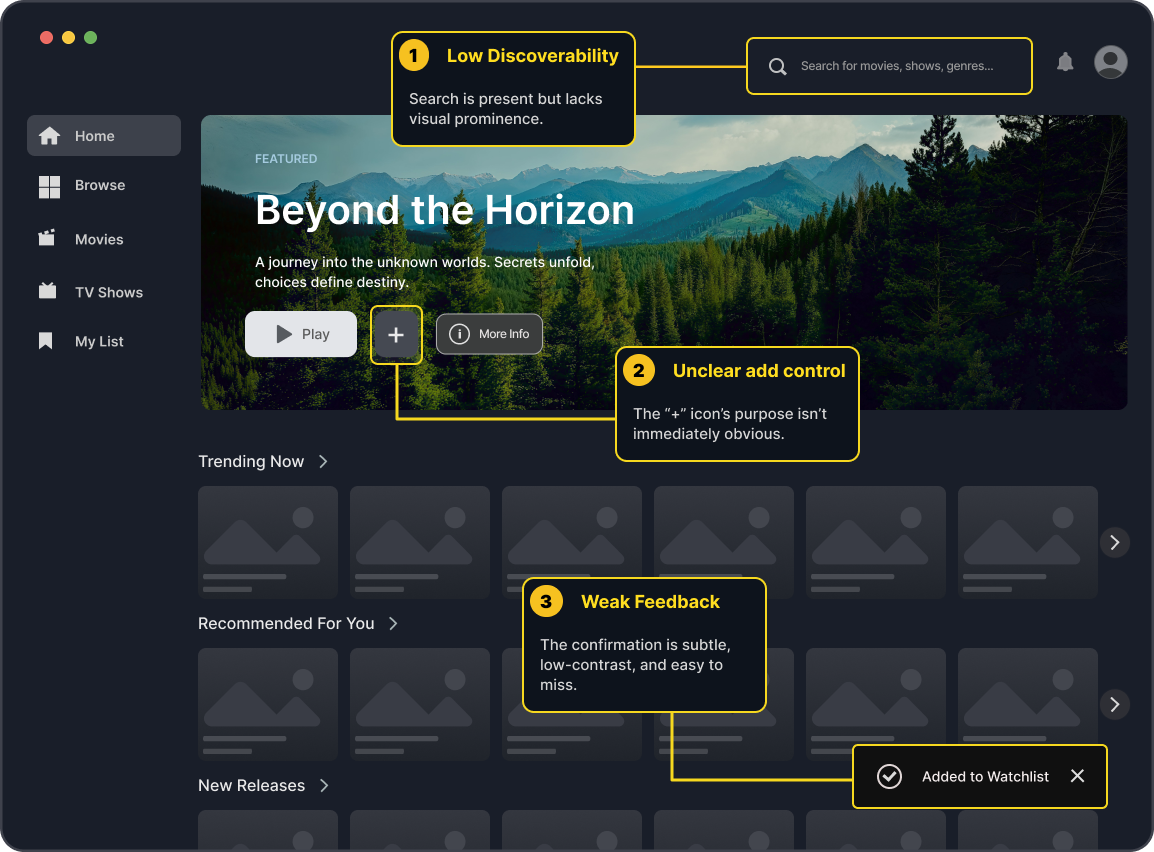
The participant experienced friction locating the correct controls, interpreting the interface hierarchy, and confirming that the title was added to the Watchlist.

Goal
Identify usability issues and recommend design improvements that make adding to the watchlist intuitive, fast, and rewarding, ultimately increasing user engagement and retention.
Study Scope & Methodology


Scope

Focus on the “Add to Watchlist” task flow
Assess discoverability, clarity, and feedback
Evaluate mental models and expectations
Identify simple, high-impact improvements

Methodology
Remote moderated usability session
Think aloud protocol
Task-based scenario
Post-task interview / SUS reflection
1
Participant
Adult streaming user
Remote moderated session
Key Findings
1
Low Discoverability of Search Icon
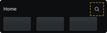
The participant initially overlooked the search icon on the homepage and relied on scanning, increasing time and effort to find a specific title.
2
Confusion Between Watchlist
Header & Add Button
Header & Add Button
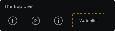
The participant interpreted the Watchlist label as an action before recognizing the plus icon as the actual add control.
3
Insufficient Feedback After Adding

The participant was not fully confident the action succeeded because the feedback was subtle and easy to miss.
Recommendations
1
Make Search More Prominent
Increase contrast, size, and spacing of the search icon and keep it persistently placed in primary navigation.

2
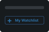
Clarify Watchlist Controls
Use a clear “+ My Watchlist” button on content detail pages and treat the Watchlist header as navigation to the list.
3
Provide Stronger Confirmation
Use a larger toast with a checkmark, subtle animation, and auto-dismiss timing to reinforce success.

Potential Product Impact

Increase Engagement
Easier save actions lead to more titles being added and more time spent on platform.

Improve Retention
Users return more often when they can easily pick up content they planned to watch.

Boost User Confidence
Clear controls and feedback create trust and reduce abandonment
and churn.
and churn.

Low-Cost, High-Impact
UI refinements with minimal engineering effort can yield meaningful usability gains.
Key Takeaways / Outcome
Small usability gaps in core tasks create outsized friction.
Clear hierarchy and feedback build confidence and speed.
Testing with real users reveals assumptions we can’t see.

Simplicity is not the absence of features, but the clarity of the path to accomplish what matters.
- Michael Ayala

Outcome
The recommended improvements provide a clearer, faster, and more satisfying watching experience, driving engagement and loyalty.